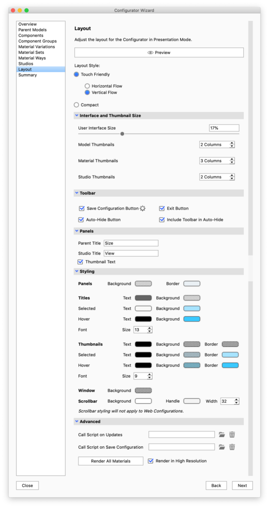
Layout
The Layout section is where you define the style of Presentation Mode for each given Configurator scene. You can choose between a Compact toolbar or Touch Friendly thumbnail interface.
When using the Touch Friendly mode you can choose between horizontal or vertical layout. Furthermore mode you can set the size of the panels, and adjust thumbnail sizes.
|
Preview
Layout Style
Interface and thumbnail size
|
In this section you can select which buttons will be visible in the configurator toolbar along with the regular navigation buttons. When the Auto-hide button is enabled, the UI will be hidden if the user does not interact with it. Tab the screen/move the mouse to the UI area to bring it back.
Panels
Here you give a name to the choice of parent model, which is the first choice in the sequence of choices that make up the configuration. As well as to the section where the user can select between studios.
Styling
- Panels – Sets the colors of the UI itself
- Titles – Controls the appearance of the titles of the choices. note that the text colors will also apply to arrows etc. in the web version of the configurator.
- Thumbnails – Controls the appearance of the thumbnails.
- Window – sets the background color of the window – this is primarily relevant for web configurations or cases where the image size is locked.
- Scrollbar – controls the appearance of the scrollbars in Presentation Mode/KeyShot Viewer. This will have no effect on web configurations.
Advanced
- Call script on… – Offers the option of using scripting with your configurator.
- Render All Materials – The first time a material is present in the configuration a thumbnail is automatically rendered, but if you have made changes to your materials you may need to re-render. If you use large thumbnails in the configurator layout, it will also be a good idea to re-render materials in high resolution. Model Set and Studio thumbnails can be set to high resolution in the respective panels.
Note
KeyShot 8.2 introduced a styling section that enables you to easily customize the colors of your Configurator menu. In previous versions this could be achieved via the style sheet.
When opening older scenes in KeyShot 8.2 or later versions, the color values from the style sheet will automatically be mapped to the relevant colors in the style section. However, you may still have to update some values.