The Configurator Wizard enables you to set up a string of model and material choices for your product. Furthermore you can select a number of studios on which your model can be viewed.
The building blocks for the configuration is Model Sets and Multi-Materials. The Model Sets will constitute base model (Parent models) and possible product variations (Components) and the Multi-Materials will make up the Material Variations – these can be grouped in Material Sets/Material Ways which facilitates switching multiple materials in one click.
When you have finished the Configuration wizard, the configuration can be shared for KeyShot Viewer, rendered as a series of still images or set up as a web configuration.
Overview
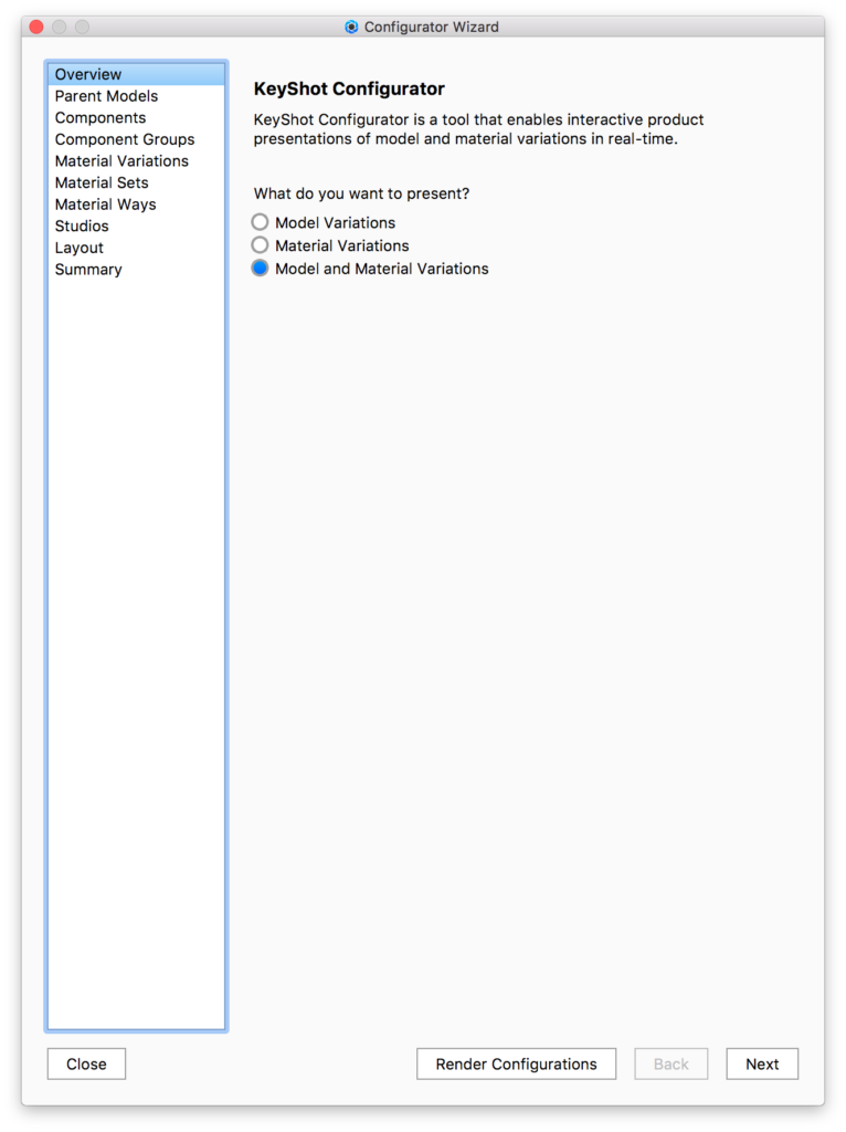
The first step of the Configurator Wizard is to select what you want to present – Model Variations, Material Variations, or both.
Model Variations
Use to set up a Configurator to display different models or combinations of models.
Material Variations
Use to set up a Configurator to display different materials for a single model.
Model and Material Variations
Use to set up a Configurator to display different model configurations and materials for any model configuration.
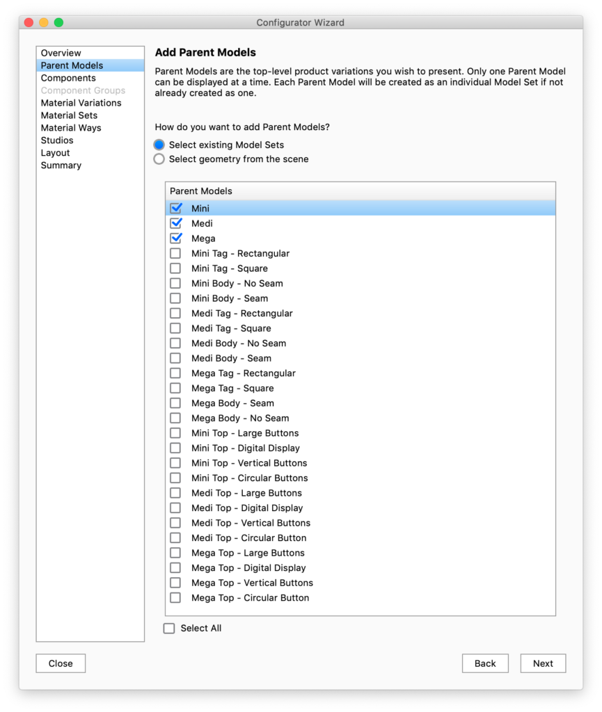
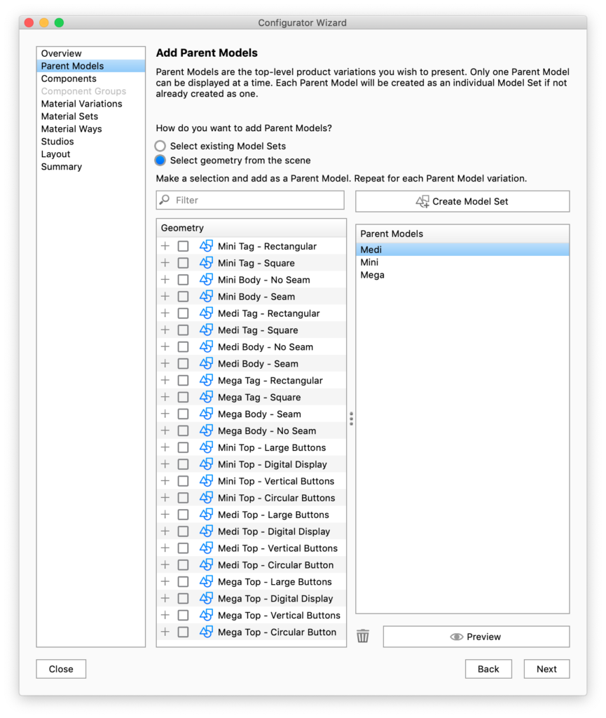
Parent Models
The second step is to define the Parent Model, which is the top-level product variation you wish to present. This is required even if you are only presenting Material Variations. If this is the case you can simply select the Default Model Set as your Parent Model.
The Configurator requires each model / model component to be in their own Model Set, in order to be able to switch between them. Parent models are the options of first choice the user will have to make in the Configurator.
Select existing Model Sets
If you already have separated Parent Models and components into Model Sets, choose the Model Sets that you want to be parent models.
Select geometry from Scene
If you have not got each of your Parent Models and Components in separate Model Sets, you can create them here by using the option to Select geometry from the scene. To do so, check the box next to the model or parts you want to define as the Parent and click the Add Model Set button above the Parent Models list. This will automatically create a Model Set in the Project window. Once one or more Parent Models have been added in the Configurator Wizard you can select in the list and click the Preview button to view and confirm in real-time.
Components
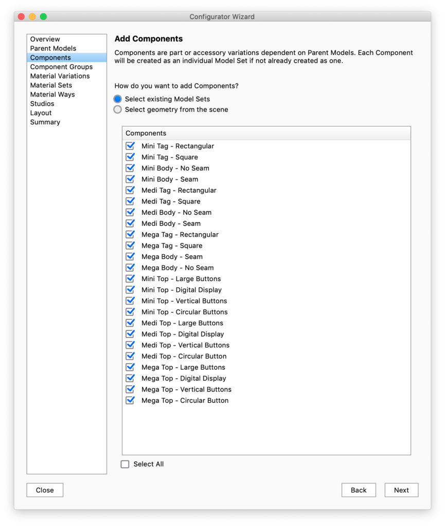
If you wish to present part or accessory variations you will need to add Component Model Sets. These will be the options in subsequent choices once the user has selected a parent model in the Configurator.
Once again you can select existing Model Sets if you have already separated them in the Scene tab or select geometry from the scene manually.
Select the Model Sets you want to use for components and proceed to the next step.
Notice that the names of the Model Sets will be exposed in the Configurator UI
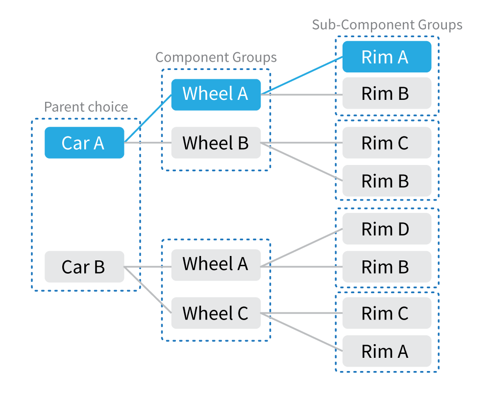
Component Groups
After selecting which Model Sets are going to be components in your Configurator, you need to set up the relationships between Parents and components in Component Groups and Sub-component Groups. A Component Group or Sub Component group is a group of components that the user can choose between. Component groups are tied to the choice of a specific Parent and Sub Component Groups are tied to the choice of a specific Component
A component can be reused in multiple component/sub-component groups, if the parent or parent component is different.
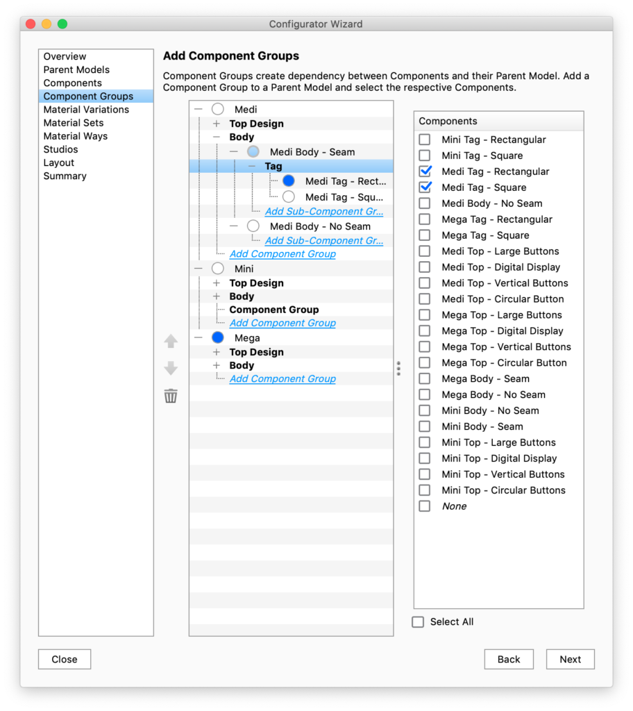
Add Component Groups
Simply click the inline link Add Component Group or Add Sub Component Group and check the respective Components in the list on the right. Repeat this until all relationships are defined. You can also select None as an option if you wish to display the Parent Model with no Component. In this example of a car with wheels it would not make sense to do so.
Remove Component Groups
To remove a component from the component group uncheck in the Components list. To remove a Component group, right-click the group and select delete. This will not affect the Model Sets, only the relationships you have set up.
Default choice
The radio buttons in front of each component determine the default option within that choice.
Order
If you want to list the options in a specific order, you can move them up/down with the buttons to the left of the tree-view.
Material Variations
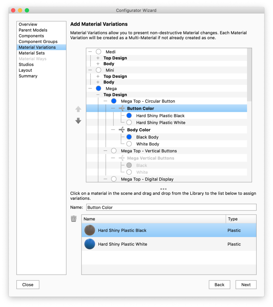
In this step you can add additional materials to existing Multi-Materials or convert “simple” materials to Multi-Materials
The list displays all the Multi-Materials in the current scene. When you select one of the Multi-Materials, the lower list (pictured in the example at the right) will display all materials it consists of.
Add to existing Multi-Materials
To add to an existing Multi-Material simply click the material in the list and drag new materials from the Library and drop them into the lower list.
Add New Multi-Materials
New Multi-Materials are added by selecting the desired material/part in the Real-time View, then dragging and dropping materials into the lower list. You will then see the material spheres populate the list to select and preview.
Once materials are in the list you can give the Material Variation a name i.e. Wheel Accent. This material will become a Multi-Material in your scene that can also be accessed and further edited from the Material tab.
Remove Material Variations
To remove variations from a Multi-Material select the Multi-material either in the list or by selecting a part (with the material) in the Real-time View. Now the bottom list shows the variations of the Multi-Material. Select the variation you want to remove and click  . You can repeat this until there is only one variation left, reverting the Multi-Material to a single material.
Material Sets
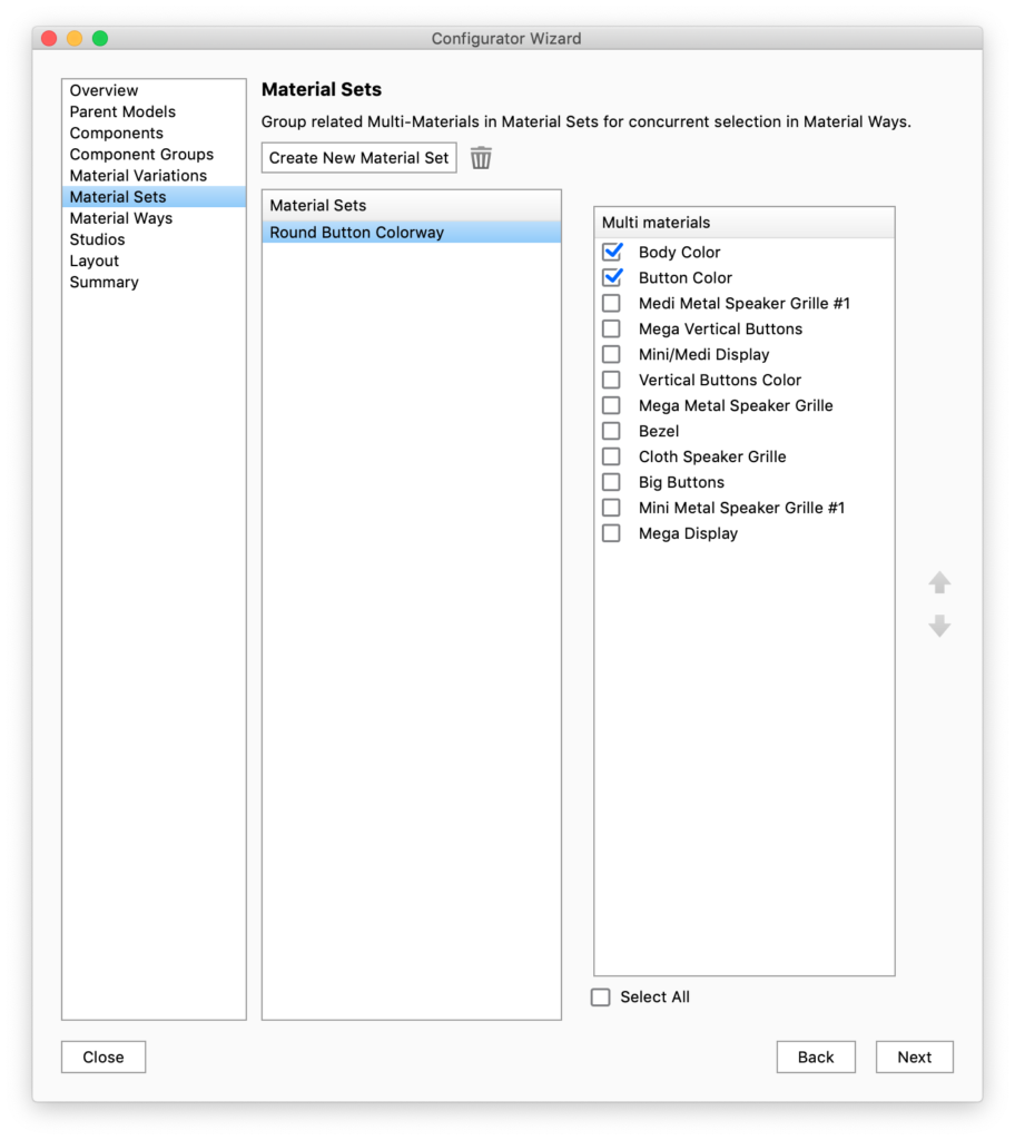
With Material Sets you can group Multi-Materials that you want to be able to change concurrently with Material Ways.
Create Material Set
Click Create New Material Set and check the Multi-Materials you want to group.
Once a Material Set is in the list you can rename it. The name will be used in the Configurator UI.
You can have multiple Material Sets but a Multi-Material can only be a part of a single Material Set. Any Multi-Materials that are already a part of a Material Set will be disabled in the list.
Delete
To delete a Material Set, select it in the list and click , this will make the Multi-Materials available for re-selection.
Material Ways
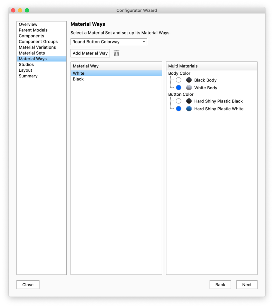
Material Ways are the options within a Material Set.
Select a Material Set in the drop-down and click Add Material Way. Then select the material combination you want in the current Material Way, by marking them with the blue bullet.
Make sure to give each Material Way a useful name, as they will be used in presentation mode/KeyShot Viewer.
Studios
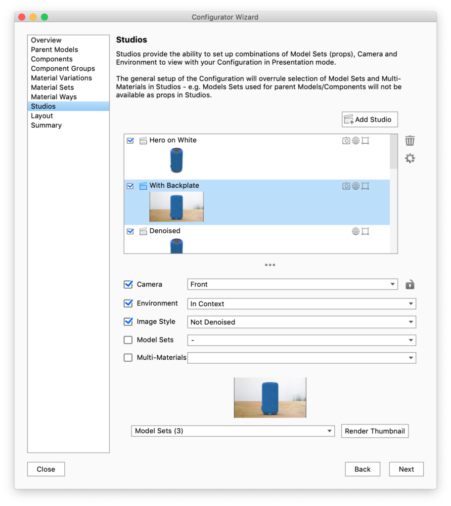
Studios can be enabled in order to change preset Cameras, Environments Image Styles and prop/scene geometry created as Model Sets.
Select which Studios you want included in the presentation by checking/unchecking them or add a new studio if necessary.
If no studios are selected, the Studios tab in presentation mode will not be displayed and the presentation will use the current environment and camera position.
Camera
You can lock/unlock the Camera by clicking the lock icon next to the camera drop-down. If a Studio contains a locked camera, it will also be locked in presentation mode and the user will not be able to tumble/pan/dolly. In Presentation mode this is shown by a small lock icon in the top right corner.
Model Sets and Multi-materials
Any Model Sets/Multi-Materials that can be set as a part of the configuration will be ignored when you switch Studio in the presentation, even if they are set up to belong to a Studio. This means that only “prop” Model Sets/Multi-Materials can be displayed/hidden/changed with Studio switch.
Thumbnails
If the default thumbnail that is generated does not contain the elements you want displayed, you can select witch Model Sets to include in the drop-down at the bottom of the page and re-render the thumbnail.
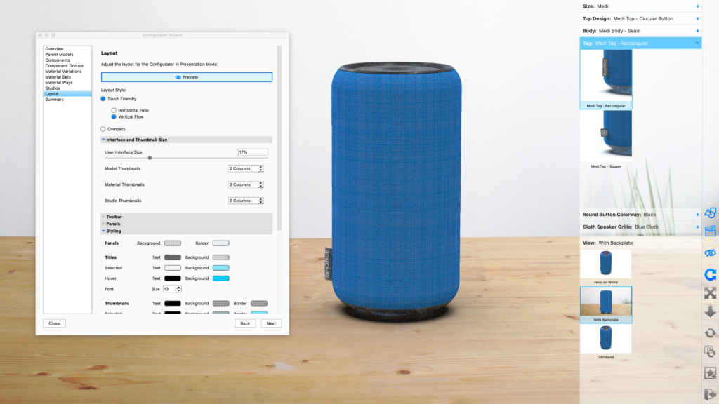
Layout
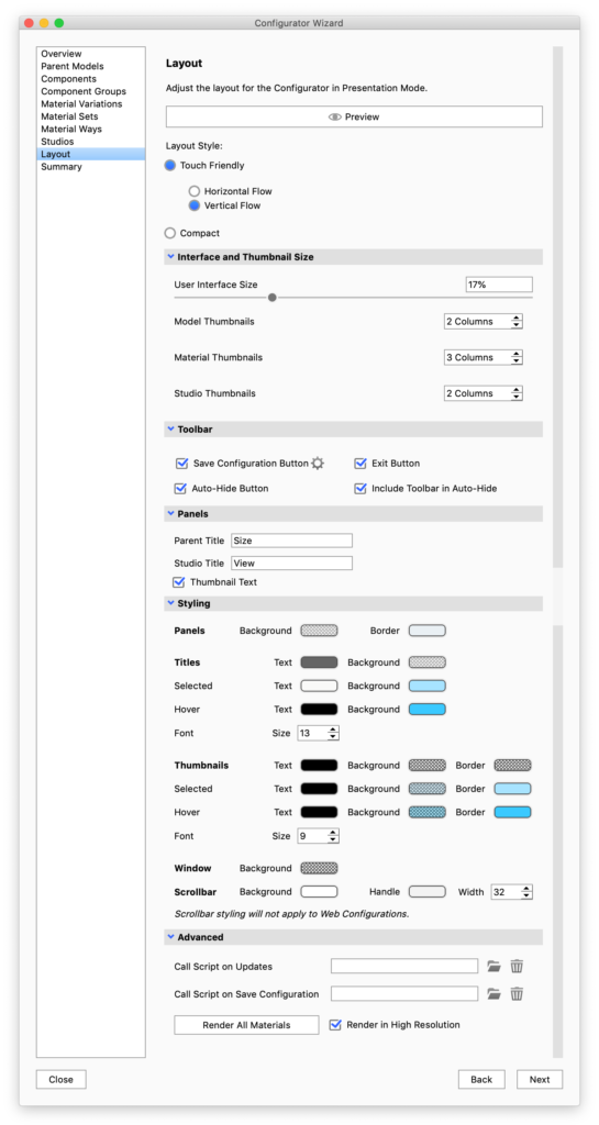
The Layout section is where you define the style of Presentation Mode for each given Configurator scene. You can choose between a Compact toolbar or Touch Friendly thumbnail interface.
When using the Touch Friendly mode you can choose between horizontal or vertical layout. Furthermore mode you can set the size of the panels, and adjust thumbnail sizes.
Preview
This lets you view your layout choices immediately.
Layout Style
- Touch-friendly – a sleek and minimal UI that is well suited to mouse and touch input.
- Panels – layout with thumbnails ect. This is the layout mode used for Web Configurations as well.
- Horizontal – the options are displayed horizontally in the bottom of the screen
- Vertical – the options are displayed in a vertical panel in the right side of the screen
- Compact mode – uses standard drop-downs for selecting choices/options. When this is active only a few of the following options will be visible.
Interface and thumbnail size
- User interface size: Select the height/width of the Configurator UI. This is set as a percentage of the window size.
- Thumbnail sizes: the thumbnail size is determined by the number of columns/rows that will fit into the UI height/width.
Toolbar
In this section you can select which buttons will be visible in the configurator toolbar along with the regular navigation buttons. When the Auto-hide button is enabled, the UI will be hidden if the user does not interact with it. Tab the screen/move the mouse to the UI area to bring it back.
Panels
Here you give a name to the choice of parent model, which is the first choice in the sequence of choices that make up the configuration. As well as to the section where the user can select between studios.
Styling
- Panels – Sets the colors of the UI itself
- Titles – Controls the appearance of the titles of the choices. note that the text colors will also apply to arrows etc. in the web version of the configurator.
- Thumbnails – Controls the appearance of the thumbnails.
- Window – sets the background color of the window – this is primarily relevant for web configurations or cases where the image size is locked.
- Scrollbar – controls the appearance of the scrollbars in Presentation Mode/KeyShot Viewer. This will have no effect on web configurations.
Advanced
- Call script on… – Offers the option of using scripting with your configurator.
- Render All Materials – The first time a material is present in the configuration a thumbnail is automatically rendered, but if you have made changes to your materials you may need to re-render. If you use large thumbnails in the configurator layout, it will also be a good idea to re-render materials in high resolution. Model Set and Studio thumbnails can be set to high resolution in the respective panels.
Styling
In KeyShot 8.2 we have introduced a styling section that enables you to easily customize the colors of your Configurator menu. In previous versions this could be achieved via the style sheet.
When opening older scenes in KeyShot 8.2 or later versions, the color values from the style sheet will automatically be mapped to the relevant colors in the style section. You may however still need to update some values. View mapping rules
Summary
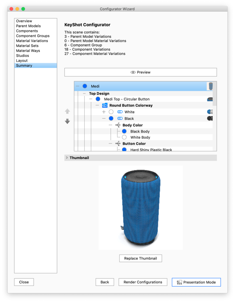
The Summary section allows you to see an overview of the number of variations in your Configurator and to preview each of the variations in the Real-time View before entering Presentation Mode.
Naming
The names of Model Sets, Component and Sub-Component Groups, Multi-Materials and Materials, Material Sets and Ways may all be exposed in the Configurator UI. Select and click again to rename, or choose Rename in the context menu.
Ordering
The order if items in the summary matches what you will see in the Configurator UI. You can reorder by selecting the item you want to move and use the arrows to the left of the list.
Default options
You can select which options the configurator starts with, as well as what options are the default option within a Choice (Component Group / Sup-component Group / Material Set / Multi-Material), by turning on the blue button in front of the option. The branch with the active model and material configuration, will be enabled in the overview, while the rest will be greyed out.
Thumbnails
The summary step of the Configurator Wizard also gives you the option of re-rendering or adding custom thumbnails for Model Sets, Materials and Material Ways. The overview shows a mini thumbnail for all items, hover over this or select to preview the thumbnail. If you want to replace it with an image of your own or render a new thumbnail, select the item and click the Replace Thumbnail. A dialog will appear, with following options
- Model Sets
- Inherit from Model Set: this will use the thumbnail created in the Model Set panel
- Custom Image: this option lets you select an image on the disk. This will be scaled down to match the size of the rest of the thumbnails. You may want to consider what aspect ratio your custom image has, so that it fits well with the other thumbnails in the current group/set when it is scaled down to match.
- Render: this option will let you render a new thumbnail, while selecting studio, whether to show the model isolated or in context, i.e. with all the default options related to the item. You can also select the aspect ratio of the thumbnail, as well as adjust the position of the item and the size and quality of the thumbnail image.
- Materials
The default thumbnail will show the KeyShot material ball with the current material. This can be replaced with a custom image. - Material Ways
The default thumbnail will show 3 KeyShot Material balls with the first 3 materials in the material way. This can be replaced with a custom image.
Using the KeyShot Studio Configurator – Webinar
In the this video, we show how to use the KeyShot Studio Configurator to present model and material variations in real-time for design reviews or touch-enabled customer experiences.
but the video gives a good overall idea about the Configurator and how to use it.