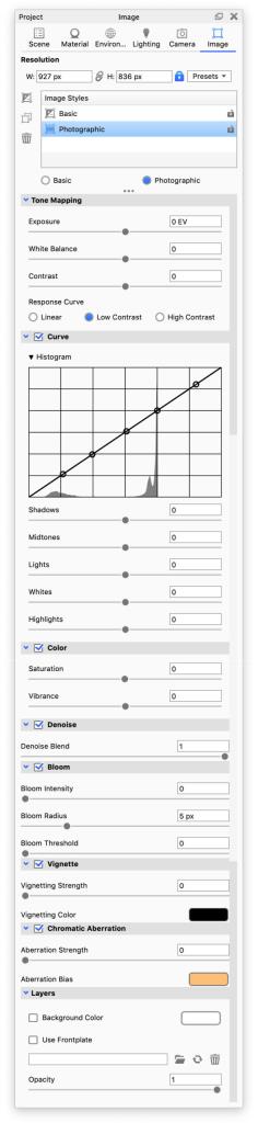
The Photographic Image Style takes advantage of the HDR image and gives you more control when you want enhance details in areas that would otherwise be perceived as underexposed or blown out. In the Basic Image Style the range is linear and stops at pure white (Whites) while Photographic Image Style offers control of the range beyond Whites with Highlights.
Tone Mapping
- Exposure – Determines how affected the scene is by the light. Increasing the EV (exposure value) by 1 will double the amount of light in the image.
- White Balance adjust the color temperature of your image. Negative values will return warmer tones and positive will give cooler tones.
- Contrast – Determines the difference between black and white. When you lower the contrast the colors will start melding together, while increasing the contrast will make bright parts brighter and dark parts even darker.
- Image Transform – Determines how the mapping curve is interpreted.
- Linear – Linear response curve where highlights will be clamped. This is similar to the Basic Image style
- Low Contrast – Values near the minimum or maximum are compressed, to be suitable for high dynamic range scenes – Scenes with large contrast in light e.g. interiors with sun and sky.
- High Contrast – Values near the minimum or maximum are compressed, to be suitable for medium dynamic range scenes – Scenes with low/moderate contrast in light e.g. Product shots with diffuse lighting.
- ACES – Preserves the hue of intense colors such as brightly lit LEDs and provides a filmic look with natural colors.
Curve
- Histogram – The histogram gives a visual representation of the shadows, midtones, lights, whites and highlights in the image. Each control point is tied to a value and any changes made to either the input values or position of the control points will update respectively. The Histogram can be hidden/shown by toggling the little triangle next to the Histogram title.
- Shadows – Add detail in these areas by increasing the shadow value or make the dark areas of your image seem even darker by decreasing the value.
- Midtones – When adjusting the Midtones you affect the values mid-way between shadow and highlight. Increasing the value makes midtones lighter while decreasing makes midtones darker.
- Lights – Adjusting the Lights value will affect the lighter areas within the midtone range.
- Whites – This value represents the “white-point” e.i. the equivalent of white paper seen in daylight. Increasing the value will make whites seem “whiter” – while decreasing the value will make them more grey.
- Highlights – Adjusting Highlights affects the areas that are receiving the largest amount of light and are reflecting light source most efficiently. Add detail to the these areas of your image by decreasing the highlight value or make the areas seem even brighter by increasing the value.
Color
- Saturation – Uniform increase/decrease of the intensity of the colors. Negative values will de-saturate your image while increasing the value will make the colors in you image more saturated. 0 is neutral.
- Vibrance – Increases the the intensity of more muted colors without adjusting the the saturated colors.
Denoise
Denoising will even out noise in the image, both in the Real-time View and in the final rendering. In the Real-time View, it will kick in after 1 second and be refreshed every 5 seconds (the interval can be adjusted in Preferences). You can always follow the Denoise state in the Heads Up Display. Denoising can also be toggled from the Ribbon, but the button will be disabled, if you have locked your image style.
- Denoise Blend – The Denoiser creates a denoised image which is blended with the rendered image. The Denoise Blend slider enables you to control the strength of the denoise effect. Decreasing the value will allow more of the original noise in the image.
If you have a scene with fine details or textures, the denoise may wipe out the details – try to decrease the Denoise Blend value. - Firefly Filter – The Firefly Filter may help to reduce pixels that stand out in the image. The slider enables you to control the strength of the filter. A high amount of filter may in some cases remove details in the image that are wanted. If this happens, try decreasing the value.
Note
KeyShot Studio 2024.3 an onward uses progressive denoising if you have a Nvidia RTX 20-series GPU or newer. This is independent of you being in CPU or GPU mode. Systems with older GPUs ( GTX 900- or 10-series) will default to the old denoise.
Sharpen
The Sharpen effect will make the edges of your image appear more sharp allowing you to make details stand out more.
-
Intensity - The darker edges will appear darker and the lighter edges will appear lighter, effectively making the image more "intense".
-
Radius - The area around the edges will be increased, making them appear wider and more noticeable.
Bloom
- Bloom Intensity – The brightness of the light fringing or glow.
- Bloom Radius – Determines how far the bloom glow extents in pixels.
- Bloom Threshold – The clipping of the bloom glow to bright pixels. A value of 0 means no clipping. Larger values focus the bloom on the brightest pixels.
Warning
The Bloom radius is defined in pixels and this value is not relative to the resolution. – This means that the bloom radius will not scale if the Render Output has a larger resolution than the Real-Time View.
Vignette
Vignetting adds a light fall-off where the image typically gets darker towards the corners.
- Vignette Strength – Determines how strong the vignette is, the higher the value the more solid the vignetting color will seem in the corners.
- Vignetting Color – Choose the color that the vignette fades into, defaults to black. Click in the color-field to trigger the color selector.
Chromatic Aberration
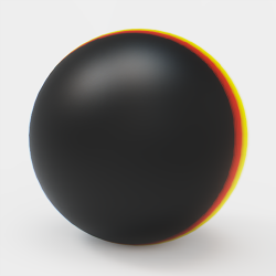
Chromatic Aberration occurs in real life when the camera lens is unable focus all colors to the same point. This results in colored fringing along the edges of the object. With Image styles you get an approximation of the effect.
- Aberration Strength – Determines how strong the effect is.
- Aberration Bias – Controls the color of the distortion.
Known Issue
Using Chromatic Aberration on a model that exceeds the image size may cause artifacts near the edges.
Layers
- Background Color – Checking the background color will place model on a solid colored background, you can set the color here – click the color-field to trigger a the color selector.
Environment background
Using a background color in the Photographic Image style will override the Environment background setting. However the colors of the shadow will still be influenced by the environment settings – So to achieve the best shadows it is a good idea to use a black background in the environment, when using a Image Style Background color
- Use Frontplate – With Frontplate you can add an image-layer in front of the image.
- Add image by pressing the folder icon
 or by dragging an image onto the input field either from a local folder or from the library. Supported file formats include .jpg, .jpeg, .tif, .tiff, .bmp, .png, .gif, .dds, .hdr, .hdz, .exr, .tga, .ppm, .ktx, .psd.
 - You can refresh the Frontplate by clicking the refresh icon
 .
. - To delete a Frontplate click the trash icon
 .
.
- Add image by pressing the folder icon
Note
Images used as Frontplates will be stretched to fit the current aspect ratio.
- Opacity – Set the opacity of the Frontplate by adjusting the slider or by entering a value from 0-1, where 0 is fully transparent and 1 is solid.